On this project I was the lead designer for Staysure's travel insurance online sales journey, I took charge of optimising conversion rates and I spearheaded a complete redesign of the end-to-end user experience, with assistance from other designers towards the end of this project.
I started from essentially a blank canvas, which included the creation of the first iteration of our design system from its inception to deliver for this project. Through the redesign efforts, we achieved a remarkable result, increasing conversion by 3% adding millions in EOY incremental margin. The Q&B journey became a cornerstone of the groups digital transformation project, with over 3.2 million user sessions in 2022.
Leading travel insurance for older people with pre-existing medical conditions
The
Challenge
I was brought in to increase conversion through experimentation and testing. The business had ambitious growth goals and Staysure, positioned as the flagship brand within the group, found itself directly in the sights of the Senior Leadership Team.
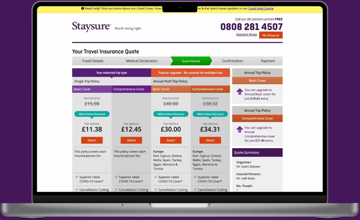
The Staysure quote and buy journey had usability challenges, including issues with accessibility, UI inconsistencies, and errors. The design inconsistencies, such as varying fonts, colours, and styles, led to confusion, affecting form fields and CTAs.
There was insufficient consideration for accessibility, given that the demographic was for people ages 50+, this was a big issue that needed to be addressed. The inconsistent branding undermined recognition and trust, highlighting the importance of a cohesive brand application for identity and loyalty.
🔍 Problems
Customers who were surveyed reported a confusing online experience. Resulting in mistrust and frustration at many points during the journey.
The price presentation page was poorly designed for both desktop and mobile devices, resulting in a significant exit rate.
Despite the fact that 58% of users accessed the site through mobile devices, it was not optimised for them.
Technical jargon and industry-specific terms used throughout the journey made it difficult for customers to understand what they were purchasing.
🎯 Goals
Increase conversion rate by conducting user research and experimentation.
Improve usability and address accessibility issues by updating the UI to align with the design system.
Identify and address significant areas of underperformance in the customer journey by analysing GA & CS data.
Personalise the journey giving them a better experience and making them feel looked after.
Ensure that the older demographic is confident in their knowledge of declared pre-existing medical conditions and policy coverage.
The Process
Journey Audit
Starting with the Nielsen heuristics as a evaluation method. I documented issues across the full funnel. Looking initially at creating quick wins to kickstart experimentation. Before progressing to a more in-depth analysis, honing in on particularly concerning areas of the user journey.
1.
Poor Mobile Optimisation:
Difficult to complete tasks on mobile devices due to lack of optimisation, despite 58% of users accessing the site through mobile.
2.
Outdated Design and Accessibility:
Use of outdated aesthetics and inadequate consideration for users with disabilities. Given that Staysure’s demographic is older people, accessibility needs careful consideration.
3.
Inconsistent UI Design:
Different fonts, colours, and styles used throughout the website, causing confusion. Form fields, information boxes, and call-to-action buttons vary across the site.
4.
Inconsistent Branding:
Lack of a cohesive brand experience form other areas of the site, undermined recognition and trust. Using consistent branding improves recognition, trust, and loyalty.
5.
Information Overload:
Overwhelming amount of information with no user guidance or introductory copy. A lot of outdated content, clunky legal text, and industry-specific jargon makes it difficult for users to digest.
6.
Unclear Hierarchy:
Lack of organisation, making it difficult for users to navigate and understand the information. Several actions can be taken on the first screen. The main focus of getting a quote is lost.
User Research
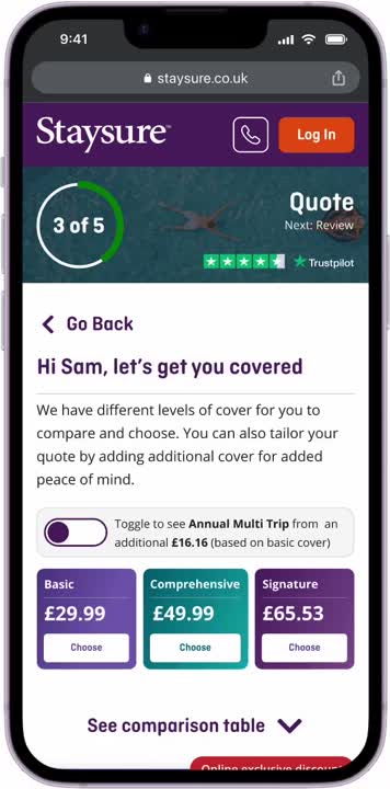
We collaborated with two agencies to undertake user research. The initial agency focused on exploring the introduction of a third level of coverage named 'Signature' and its presentation on the pricing page. From this research, we obtained invaluable insights that we subsequently used to refine and test the pricing page in the final build.
Objectives
Identify ways to improve quote journey usability and product clarity
Understand which product summary (current or new) has the highest propensity to convert
Methodology & Participants
Current Staysure customers
Pre-existing medical conditions
Aged between 50-70
Research Objectives
Understand how customers search to travel insurance generally, their expectations and priorities.
Identify Staysure quote journey usability issues
Compare Staysure current vs new quote summary to assess impact of introducing Signature
Assess Signature naming clarity and relevance
Participants
* These images act as a representation only
Research Outcomes
The research outcomes provided us with valuable insights to guide our experimentation efforts. They offered numerous quick wins to enhance usability and address significant issues within the user experience. These insights have also played a crucial role in influencing the improvements made to the user interface, ensuring a more intuitive and seamless interaction for our users.
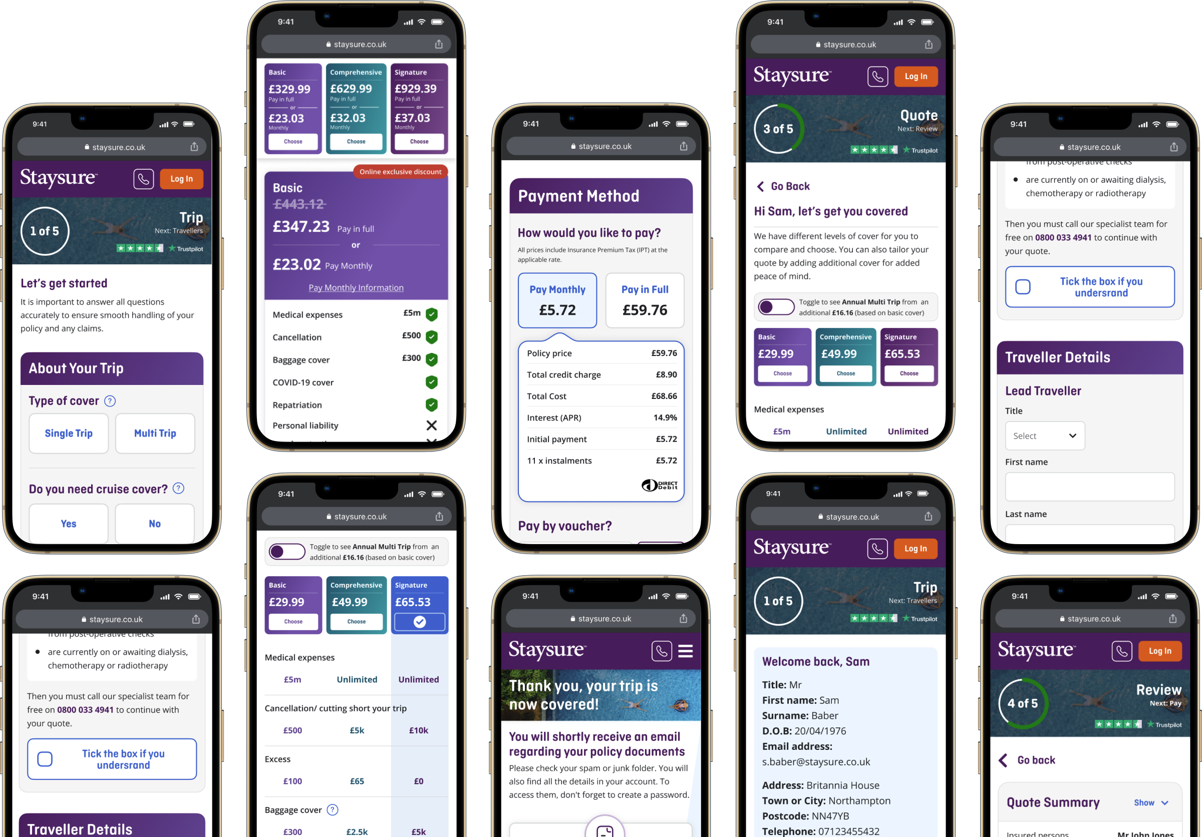
Destination Dropdown
Issue: Users missed clicking to save in the country list dropdown, and duplicated entries confused users. Recommendation: Remove duplicate countries and explore alternatives for country selection to enhance clarity.
Calendar Input
Issue: Users preferred inputting dates into one calendar instead of two. Recommendation: Allow users to enter departure and return dates in a single calendar for improved user experience.
Medical Disclaimer
Issue: Users sought clarification on terms like ‘undiagnosed symptoms’ and ‘awaiting any tests,’ leading to calls to customer service. Recommendation: Add an info icon with short descriptions next to ambiguous terms to enhance clarity.
Traveller Details
Issue: Users disliked re-entering title, first name, and last name, suggesting carry-over from Travel Details. Recommendation: Explore auto-populating traveler details unless a second person is added to the quote for smoother user experience.
Conditions Search
Issue: Misspelled medical conditions lacked auto spell suggestions, hindering user search. Recommendation: Implement auto spell suggestions for medical condition searches to improve usability.
Tick Boxes
Issue: Tick boxes were too small on mobile devices, impacting accessibility. Recommendation: Increase font size and select button dimensions to enhance form accessibility.
Edit Buttons
Issue: Edit buttons occasionally became hidden or frozen, requiring page refresh or answering another question to resolve. Recommendation: Investigate the root cause of the error to ensure consistent functionality.
Experimentation
Using Optimizely, we conducted A/B tests targeting multiple areas of the sales funnel, to validate and refine ideas from workshops and user research. We scrutinised aspects of usability, identifying potential areas for enhancement
ℹ️ tooltips
Adding tooltips to the price presentation page added a substantial amount of additional monthly sales.
⛑️ Exclude medical conditions
By moving the ‘Exclude medical conditions’ functionality increased progressing to the next step of the journey by 3.8%.
✈️ Price presentation page
The redesign of the entire price presentation page increased overall conversion by 2%.
UI Development
UI development began by working within the existing UI style of the site. However, I swiftly looked at areas for exploration to bring a modern aesthetic to the site exploring new design directions within the bounds of the brand guidelines. I aimed to maintain brand consistency while evolving certain elements to strike a better tone with the users.
Prototyping
Staysure 1.1 Design System
Building a design system from the scratch was initially daunting, until I discovered Brad Frost's Atomic Design methodology. Using this methodology, I created a design system that kicked off a new era of workflows with our designers, developers, and all members of the product team. The initiative set a new standard for efficiency and collaboration within the organisation.
Key Focus Areas
🎨 Brand Consistency
🧑🤝🧑 User-Centric
♿ Accessibility
⚡ Efficiency and Speed
📈 Scalability
Translating the Brand Guidelines
Using the principles of atomic design, I systematically organised and structured design elements to ensure consistency and scalability across various the various applications while staying true to the brand's identity. I used advanced techniques such as the new APCA contrast checker, which is expected to be used in WCAG 3.0 to ensure readability and usability for all users.
See More On Design Systems
This was the first iteration of the Staysure design system. However, it was succeeded by our new design system, which you can explore by clicking below to see the latest advancements.
TrustPilot reviews offer invaluable insights into customer satisfaction and usability. In this case the the reviews consistently highlighted the ease of use which reinforces the notion that the platform prioritises customer outcomes and accessibility, enhancing the overall user experience and building trust in the brand.
Project outcomes
This project was a key piece of the groups digital transformation, acting as a stepping stone to a bigger redesign, re-platform and rebrand coming in 2024. But, overall the outcome underscores the project's success in driving efficiency, enhancing user experience, and delivering tangible business results.
✅ Conversion
Uplift of 3% on a multi million pound buying journey, with over 3.2 million user sessions in 2022.
✅ Usability and Standards
We significantly improved usability and digital standards by implementing a design system with UI patterns that could be replicated throughout the journey.
✅ Dev Handovers
Working with a offshore team is difficult. I lead on improving the handover process and creating ‘dev ready docs’ which helped streamline our process and built trust and between the SL and UK team.